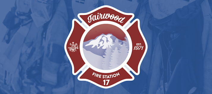
Fairwood Fire Station 17 Logo
Project Overview:
The objective of this project is to design a logo that represents the essence and beauty of the Fairwood community. The logo should capture the unique harmony between nature and residents, showcasing the breathtaking landscapes, such as Mount Rainier, and the evergreen trees that define the area. It should evoke a sense of tranquility and recollection, reminding individuals of the larger home they are a part of. The logo will incorporate a two-tone color palette, with Firebrick Red symbolizing the protection provided by Fire Station 17 and Steel Blue representing balance and harmony.
Design Goals:
Reflecting Natural Beauty: The logo should encapsulate the captivating natural elements that surround Fairwood, including Mount Rainier, evergreen trees, and vibrant sunsets and sunrises. It should evoke a sense of awe and appreciation for the unique environment in which the community is nestled.
Harmonious Color Palette: The logo will feature a two-tone color palette comprising of Firebrick Red and Steel Blue. The colors should work together to create a sense of balance and tranquility, while also representing the protection provided by Fire Station 17. The use of these colors will strike a harmonious chord and create visual interest.
Seamless Design Elements: The logo should incorporate flowing text arching above the main design, symbolizing unity and wholeness. The symbolic firefighting emblem will also be included, representing the dedication and service provided to the Fairwood community. The design elements should work together cohesively, creating a visually appealing and recognizable logo that resonates with both longtime residents and the next generation.
Implementation and Usage:
The finalized logo will be used across various applications, such as signage, stationery, community communications, and online platforms. It will become a visual symbol of Fairwood, sparking reflection and a sense of pride among community members. The logo's design elements will seamlessly flow together, maintaining a sense of balance and not overwhelming viewers. Overall, the logo will serve as a reminder of the natural beauty, harmony, and unity that define the Fairwood community.